Capital One · 2024 to 2026
Leading enterprise system theming migration
Unlocking Capital One's dynamic theming and mode capabilities within Figma & code
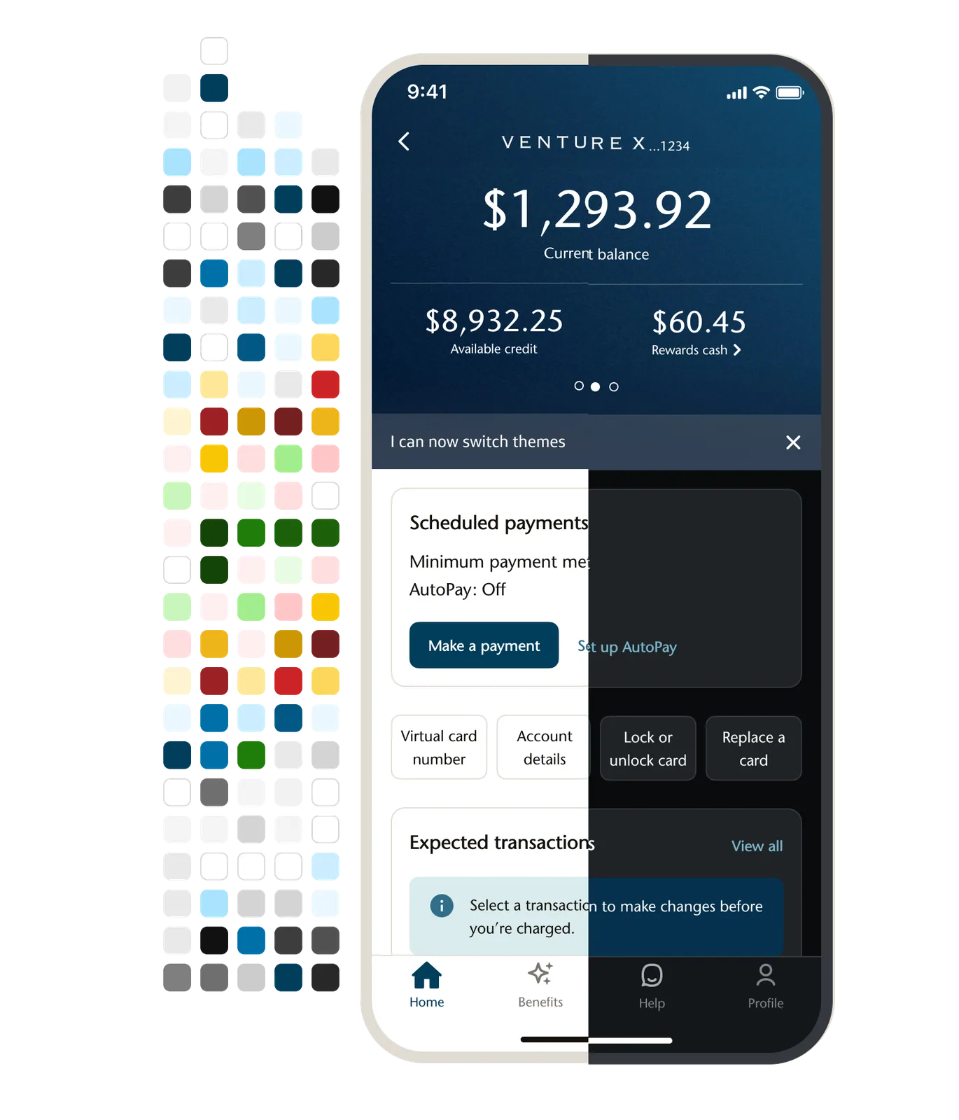
We needed to overhaul our architecture to Figma variables to better align with code and scale.
The challenge
Capital One was preparing a major brand refresh and the design system could not support it.
Everything sat on static Figma styles. Changing a color meant opening every file and updating every instance. A dark mode exploration meant rebuilding screens by hand, with results inconsistent enough that contrast bugs reached production. Our styles also failed to map with engineering tokens, so handoff carried translation errors. We needed to enable the refresh and dark mode capability in enterprise and keep teams unblocked for business-critical initiatives such as brand acquisitions.
We needed to overhaul our architecture to Figma variables to better align with code and scale.
The task was to migrate five libraries across iOS, Android, web, foundations and documentation to Figma Variables, a feature that had shipped weeks earlier and that nobody had used at this scale. We had to do it without blocking 600+ designers on business-critical work, onboard them on the new process, and finish inside the quarter.
How might we enable designers to choose semantic tokens and have it map automatically to every brand and mode instantly both in design and code?
The approach
Aligning stakeholders to risks of non-variable system architecture
I researched industry practices and early Figma testing of variable collections, as well as consumer ride-along studies. Without variables, designers spent hours doing manual updates across files. Static styles didn’t map to engineering tokens. Brand updates and accessibility fixes risked propagating unevenly across iOS, Android, and Web. Teams could not reliably toggle between dark mode, light mode, or brand palettes without doing tedious rework. By grounding the migration in these risks, I was able to frame the project as a scalability and reliability initiative, not just a tooling swap. This perspective helped align stakeholders and set the stage for adoption.
Phase 1: Process operations
I ran the project in Lucid Spark to visualize dependencies, owners, and milestones across libraries, comms, docsite updates, and training as a working sounding board, while we used Jira through Confluence to track work tickets. Weekly standups and boards kept progress visible and accountable.
Phase 2: Technical migration
This phase was the bulk of our time and work, where I divided up designers across libraries to update all style tokens to variables and map semantic decision tokens in the system. We also verified alignments with engineering.
Together, we migrated 700+ variables in Foundations, replaced legacy styles in five libraries, and did QA for theme parity across light, dark, and grayscale.
Phase 3: Testing and iteration
We hosted two focused test sessions for native platforms, 52 minutes each, with 16 to 18 iOS and Android designers.
Three follow-up 1-hour sessions across Web, Foundations, iOS, and Android where designers built with the new libraries and flipped themes live. We logged and fixed issues such as hex conversion after migration, early dark mode mapping errors, color naming confusion, and residual style references, and components that needed fixes including chips, cards, badges, and avatars.
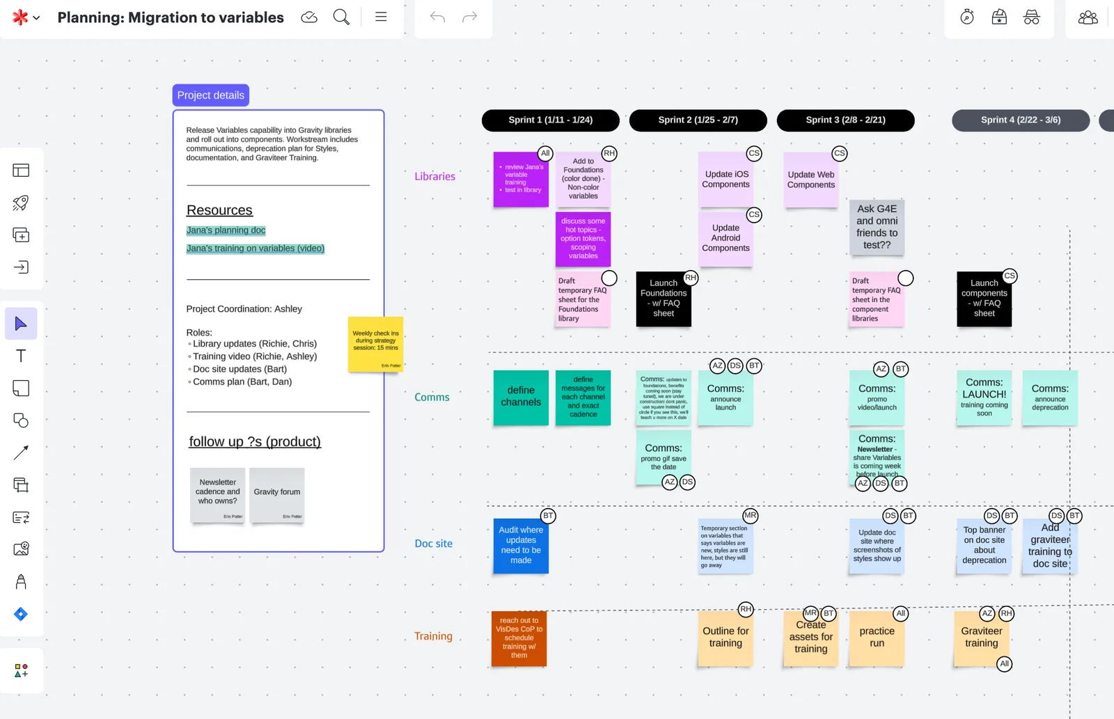
The migration board in Lucid Spark
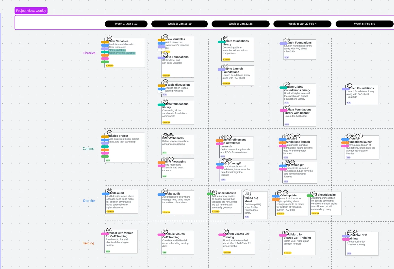
Milestones for each library, week by week
The execution
Semantic token framework restructured
Dynamic theming was enabled automatically in libraries for consumers. We established a semantic decision token structure in the Foundations library, with training and documentation guiding designers to adopt tokens that map directly to engineering, enabling scalable theming and brand alignment. We migrated 700+ tokens and 546 components across five libraries (Foundations, iOS, Android, Web, and Documentation) to shift the system from static styles to Figma variables.
Communication, education, and enablement
I designed and led training to 250+ designers with live demos of instant theme switching and building from scratch with variables, and provided recording and migration guidance to equip hundreds of designers with both the “how” and the “why” behind theming. I actively educated users in following years within onboarding, workshops, newsletter visuals, and internal design conferences on the importance of semantic token usage, theming, and advanced Figma expertise.
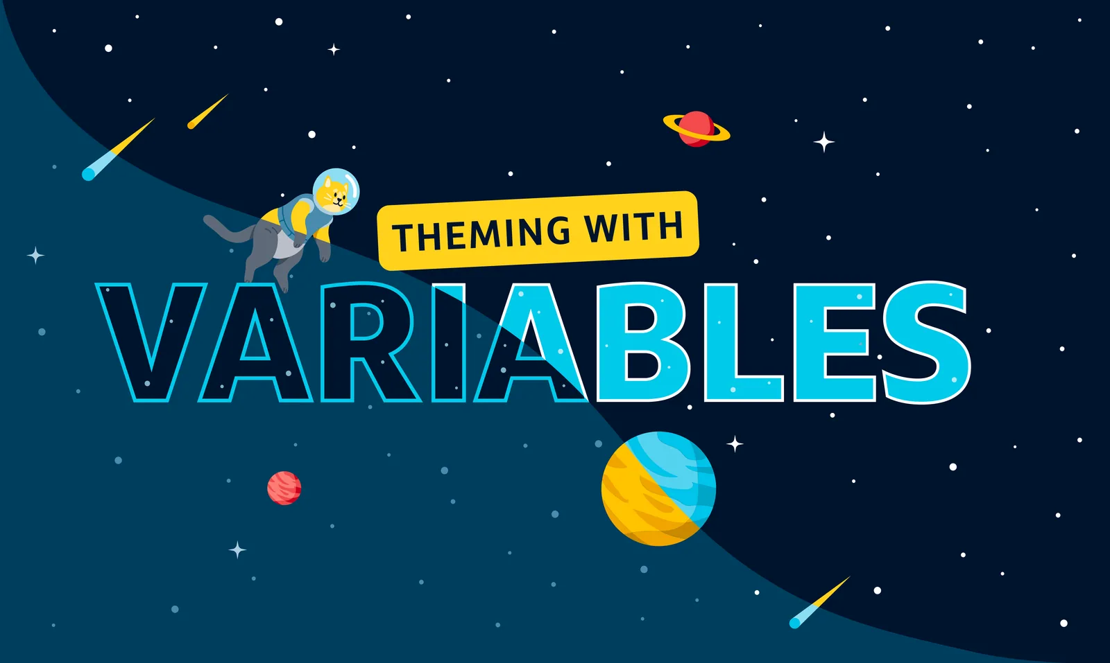
The Gravity mark, from the training materials
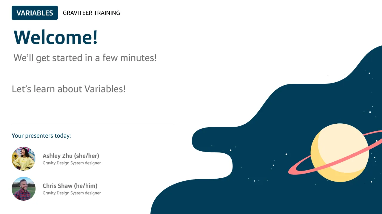
The variables training, live for 250+ designers
The impact
Confidence
Clear training and design system trust gave teams clarity and created smoother adoption.
Consistency
Semantic tokens aligned design and code, improving parity and reducing bugs.
Efficiency
Workflows that once took hours are reduced to seconds, freeing up time for higher-value work.
Flexibility
Designers can now switch between light, dark, and brand themes instantly.
100%
of Enterprise Native was enabled to turn on dark mode and Brand refresh theme at end of 2025
84k
Variable inserts in a single week post-migration
BeforePrevious theme, light mode only
AfterBrand refresh theme, light & dark mode
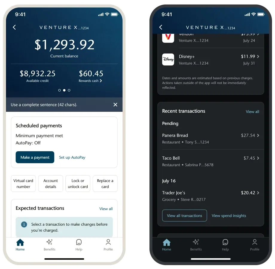
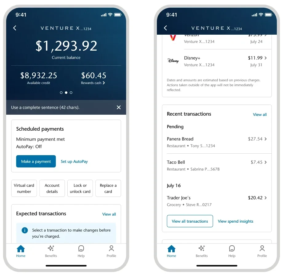
Drag to compare
The evolution
By Sep 2025, adoption hit a critical milestone: 100% of iOS and Android in enterprise native is now built on our design system using variables. This unlocked a fully refreshed look and feel in native apps, powered by decision tokens and variables. What started as a technical migration in 2024 became the backbone of a visible transformation. Since the initial migration, the variables “database” has continued to evolve. We’ve introduced extended collections, corner radius, typography, and spacing variables. The variable set is now extensive, flexible, and directly mapped across all themes and modes.
In 2026: we extended our theming collections with Capital One’s Discover acquisition.
With onboarding Discover customers and absorbing the Discover design system, we needed a quick, efficient way to keep the look and feel of Discover as they transitioned as customers, yet set up the transition to Capital One experience. With variables in the backend, we architected extended collections in order to enable an addition of a new brand theme.
To achieve this migration, we focused not only on building the system but on helping teams adopt it fully. We partnered across product, design, and tech to highlight the value of semantic decision tokens and the new color system. Because we had established a testing, communications, and rollout process before, we were able to onboard to extended collections within a 3-month time frame seamlessly.
The insights
Communicate benefits in order to get customer buy-in.
Training showing the value of semantic tokens from the customer perspective is crucial to usage.
Moderated research and testing surfaces blockers faster than async feedback.
Observing live, walking through hands-on, and seeing what the consumer experiences and reacts to the system are key drivers in building a better tool.
Project testimonials:
Ashley was an enthusiastic spokesperson for our variables rollout. Her work helped educate consumers about variables and ensure they were adopted smoothly.
Her execution of delivering variables across Figma helped manage enhancements for new functionality. She's always thinking outside the box and has a passion to innovate and try new things.
I've been impressed with Ashley's drive, dedication, and depth of thought around how our decisions will impact UX and her ability to context switch and deliver quality work.
Interactive
One decision, every brand and mode
Checking ···4821
$8,932.25
Available balance
Autopay on
View activity